Last updated: August 11, 2026
A UI kit is a grab bag of ready-made screens and parts you can assemble quickly; by contrast, a component library is a set of reusable building blocks meant to keep a product consistent as it grows. Quick answer: need a faster first draft? Choose a UI kit. Need long-term consistency? Pick a component library. For what is ui kit how does it differ from component library, the real question is blunt: do you want speed now, or a design system your team can actually maintain over time?
- A UI kit is optimized for speed. It is often used for Figma, Sketch, or Adobe XD.
- A component library is optimized for reuse. It is often built for production code and shared behavior.
- WCAG 2.2 was published by the W3C in October 2023 and is the current accessibility benchmark.
- A library is the better choice when multiple screens, teams, or releases must stay consistent.
- A kit is the better choice when the goal is a demo, prototype, or pitch.
I write about product design, interface systems, and front-end workflows, so I’m weighing what is ui kit how does it differ from component library as someone who has spent years untangling “looks finished” from “scales cleanly.” That gap can be a trap.
The Real Difference Between a UI Kit and a Component Library
A UI kit wins when you need a fast visual head start. A component library wins when you need reusable parts that behave the same way across a product. That core split matters more than the labels suggest.
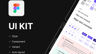
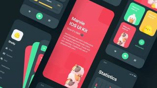
Usually, a UI kit is a stack of mockup-ready assets: buttons, forms, cards, nav bars, dashboards, mobile screens, and other visual pieces arranged to help you prototype or pitch. It is often built for Figma, Sketch, or Adobe XD, and the focus is appearance plus speed. Drop pieces into a layout, and you get something presentable fast. Easy.
By contrast, a component library is typically built for production use, often in code, and sometimes mirrored in design tools. Its job is consistency. A button in the library should act like every other button, whether it appears in a checkout flow, account page, or settings panel. The library may include design tokens, accessibility rules, documentation, and usage guidance. Without that structure, teams end up reinventing the same controls with slightly different habits.
Here’s the practical split: a UI kit helps you design something that looks real; a component library helps you build something that stays real as the product changes. Same surface, different backbone.
As a formal definition anchor, I would point to the Design Systems Handbook from InVision and the W3C’s guidance on accessible interface patterns as useful background on why reusable systems matter. For accessibility standards, the W3C’s WCAG guidance is the clearest public reference. The W3C published WCAG 2.2 in October 2023, and it adds 9 new success criteria over WCAG 2.1.
Quick rule I use
Need to make a screen look good by Friday? You want a UI kit. Want to stop the interface from drifting apart over the next year? You want a component library.
UI Kit: Who Should Actually Use This (and Who Shouldn’t)

A UI kit works best for early-stage design work, marketing prototypes, client mockups, and short-lived internal projects. It is the faster route when the goal is to communicate an idea, not to lock down a long-term interface contract.
Speed is the strongest argument here. A designer can move from blank canvas to believable screens without drawing every element from scratch, and that matters when stakeholders need to react to a flow instead of watching the process unfold. UI kits also help non-specialists; a founder, PM, or marketer can often assemble a passable mockup with less training than a full component system demands.
The downside shows up just as quickly. A UI kit can encourage “surface-level consistency” without real system discipline. Two buttons may look identical in the kit and still behave differently once the project moves into production. And it often hides edge cases. You get the happy path, then your team has to deal with error states, accessibility states, loading states, and responsive behavior later. That delay turns into a bill with interest.
I would not choose a UI kit as the foundation for a large app with multiple engineers, a long roadmap, or a strict accessibility target. It is also the wrong primary tool if your team keeps arguing over spacing, naming, or brand drift. A kit can cover those cracks for a while, but it cannot repair them.
Use a UI kit if:
- you are validating a concept;
- you need investor, client, or stakeholder visuals fast;
- you are building a short-lived campaign or prototype;
- your main goal is presentation, not code reuse.
Skip it if:
- you need shared behavior across many screens;
- several people will maintain the same interface;
- accessibility and consistency are non-negotiable;
- you expect the design to become a product.
Component Library: The Specific Situations Where It Wins
A component library is the better fit for product teams that need to ship repeatedly without redesigning the same controls each time. When the interface is going to live for months or years, the library is the safer bet. Honest answer: it costs more up front, but that math stops working fast if you keep rebuilding the same pieces.
Its biggest strength is simple: common interface pieces become dependable parts. When a button, modal, dropdown, and form field all come from the same system, you get fewer visual surprises and fewer code branches. Consistency cuts down on design debate and helps developers move faster because they are assembling known pieces instead of rebuilding them.
A component library is also where the real work of product quality lives. Good libraries account for states: hover, focus, disabled, error, empty, loading, and keyboard interaction. They also tend to define spacing, type scales, color tokens, and naming conventions. That discipline is what makes a product feel coherent across teams and releases.
The trade-off is effort. A component library takes more planning, more documentation, and more maintenance. If the team is small and the product is still changing shape, a library can feel heavy. I would also be cautious if the team lacks front-end maturity. A poorly governed library becomes a junk drawer of half-fixed components. Then the promise of consistency turns into another layer of confusion.
Use a component library if:
- multiple product surfaces need to match;
- designers and developers work together regularly;
- you care about accessibility and interaction states;
- the product roadmap will keep expanding;
- you want fewer one-off UI decisions over time.
Skip it if:
- you only need a pitch deck or clickable demo;
- the interface is temporary;
- no one owns library maintenance;
- your team is too small to support governance.
The Honest Side-by-Side

If I had to compare them directly, I would say this: a UI kit is a shortcut into the look of a product, while a component library is the infrastructure behind the product’s look and behavior.
| Criteria | UI Kit | Component Library | Winner for [condition] |
|---|---|---|---|
| Primary purpose | Fast visual assembly | Reusable product building blocks | UI Kit for early concepts; library for shipped products |
| Best stage of work | Exploration and prototyping | Development and long-term scaling | UI Kit for ideation; library for production |
| Consistency over time | Depends on how carefully it is used | Designed to enforce consistency | Component Library for multi-screen products |
| Speed to first draft | Usually faster | Usually slower at first | UI Kit for deadline-driven mockups |
| Behavior and states | Often limited or implied | Usually explicit and documented | Component Library for real product workflows |
| Accessibility support | Varies widely | More likely to be baked in | Component Library for inclusive interfaces |
| Maintenance burden | Lower upfront, can get messy later | Higher upfront, easier to govern later | UI Kit for short projects; library for long-lived systems |
| Team coordination | Works for solo or small design tasks | Helps cross-functional teams align | Component Library for larger teams |
| Risk of inconsistency | Higher | Lower | Component Library when brand and UX must stay stable |
The table makes the choice pretty plain: if your biggest problem is speed, the UI kit is enough. If your biggest problem is drift, duplication, or unclear behavior, the component library earns its keep.
Our Verdict: Which One to Choose and Why
Choose a UI kit if you are designing a concept, building a pitch, or moving fast on a temporary interface. Choose a component library if the work is meant to ship, be maintained, and stay consistent across many screens. Neither if you do not have someone who can own the system; in that case, both will decay into mismatched parts and wasted time.
That is the decision I would make.
My recommendation is not “pick the more advanced thing.” I would choose the tool that matches the lifespan of the work. Short lifespan, low governance, quick presentation: UI kit. Long lifespan, cross-functional team, real users, and repeated UI patterns: component library.
This is where people get tripped up. They buy or download a UI kit because it feels complete, then try to use it as the basis for a live product. A month later, the team is patching gaps, adding states, and rebuilding components anyway. The reverse mistake happens too: a small team reaches for a heavy component system before the product shape is clear, then spends more time managing process than making the interface usable.
When choosing for a business, I would tilt toward a component library once the interface has more than a few repeatable patterns and more than one person touching it. If you are choosing for a presentation, I would favor a UI kit because it gives you a faster, cleaner path to something that looks finished.
When to Reconsider This Choice Entirely
The biggest exception is this: if the product is still so uncertain that you do not know the core flows, neither a UI kit nor a component library should be your main investment yet. Start with rough wireframes and a simple style direction first. Otherwise, you risk polishing the wrong structure.
A second exception is a heavily branded marketing site or campaign page. In that case, a strict component library may be overkill if the page needs custom visuals that do not repeat much. A UI kit or a light, bespoke set of components may be enough.
A third exception is a regulated or accessibility-sensitive environment. Here I would be careful with any UI kit that does not clearly show states, keyboard behavior, contrast rules, or focus handling. If the kit cannot prove those things, I would not trust it as the base for production decisions. The W3C’s WCAG guidance is a useful reference for what should be covered.
A fourth exception is a tiny internal tool with one owner and a short life span. In that case, a full component library can be more structure than the project needs. The overhead may cost more than the inconsistency you are trying to avoid.
So the real flip points are:
- the product is not defined yet;
- the interface is mostly one-off;
- accessibility and interaction details matter deeply;
- the project is too small to justify system maintenance.
In those cases, the standard advice changes. Don’t force a library where a prototype is enough. Don’t force a kit where long-term consistency is the real problem.
How I Would Decide in Practice
If I were advising a team, I would ask three questions.
First: is this mostly for showing, or mostly for shipping? Showing points to a UI kit. Shipping points to a component library.
Second: how many repeated interface patterns do you already have? If the answer is “many,” a library will pay off. If the answer is “almost none,” a kit is the lighter touch.
Third: who will maintain it? A component library without ownership becomes stale fast. A UI kit without rules becomes a pile of screenshots with no system behind them.
That is why the terminology matters less than the outcome. A good UI kit gives you momentum. A good component library gives you control. Pick the one that solves the problem in front of you, not the one that sounds more mature.
FAQ
Is a UI kit the same as a design system?
No. A UI kit is usually a set of visual assets for fast design work. A design system is broader: it can include principles, tokens, components, documentation, and governance.
Can a UI kit become a component library?
Sometimes, yes, but only if someone turns the kit’s visual pieces into consistent, documented, reusable components and adds rules for behavior, states, and maintenance.
Which one is better for Figma?
For quick mockups, a UI kit is usually easier. For team-wide consistency, a component library built or mirrored in Figma is better.
Which one is better for developers?
A component library. Developers need reusable code, predictable behavior, and a shared source of truth more than they need visual shortcuts.
What should I ask before choosing one?
Ask whether the project is temporary or long-lived, how many screens will reuse the same patterns, who owns maintenance, and whether accessibility matters enough to require documented states and behavior.