Last updated: August 11, 2026
UI kits — complete guide readers usually want the blunt answer first: a UI kit is often the quickest way to stop designing every screen from zero, but only when the kit matches your product stage and workflow. Picking one? The real issue is not “What is a UI kit?” Rather, it is this: should I use a UI kit at all, or will it trap my product inside someone else’s design system? In this ui kits — complete guide, the core call is whether speed now is worth the trade-offs later.
I write about product design and front-end workflows, and I judge a UI kit by the same yardstick any product team should use: how much time it saves, how much inconsistency it removes, and how much freedom it may cost later. Quick Answer: many early-stage products can save roughly 20% to 40% of upfront interface setup time with a UI kit, but the exact gain depends on scope, team skill, and how much customization you need.
- A UI kit is a reusable set of interface parts, not a full governance model.
- UI kits can speed up early design work by weeks, but they can also create long-term maintenance debt.
- Accessibility and documentation quality vary widely, so review both before adopting a kit.
- For many teams, the best use case is prototyping, MVPs, and common product screens.
- For products with multiple teams, a design system usually becomes the safer long-term choice.
What a UI Kit Actually Is, and What It Is Not
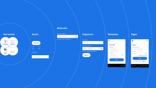
Buttons, inputs, nav bars, cards, modals, menus, icons, states, sample layouts — that is the usual UI kit package. The idea is plain enough: instead of inventing each component yourself, you start from a shared visual language.
Sounds a lot like a design system, right? People mix them up all the time. Here is the practical split I use:
- UI kit = the parts you can assemble.
- Design system = the rules, patterns, and governance behind those parts.
Some kits are just a polished Figma file. Others are a cross-platform library with docs and code. And yes, a few are built for rapid prototyping while others are meant to underpin a shipped product; same label, very different jobs.
Generic articles usually miss that point. A startup founder choosing a kit for a landing page needs something different from a product team standardizing a dashboard with multiple roles and permissions. When decisions have accessibility or compliance impact, consult a qualified professional and check the W3C Web Accessibility Initiative guidance before you commit.
Think of UI kits as a shortcut to consistency. Handy. Sometimes brilliant. That shortcut helps when speed matters; it hurts when your product needs a distinct interaction model, a strict accessibility bar, or deep customization.
A good UI kit usually gives you:
- A shared visual style
- Reusable components
- State variations like hover, focus, disabled, and error
- Responsive behavior patterns
- Basic spacing and type scales
- Sometimes documentation or code
A weak one gives you pretty screens and not much else. Looks nice. Then it turns into dead weight if you try to build a product on top of it without changing the structure underneath.
The Real Difference Between a UI Kit and a Design System

A UI kit wins when speed matters more than governance. A design system wins when consistency matters more than speed.
That is the cleanest split I know.
The usual role of a UI kit is the starting point. A design system is the operating model. If you only need to get from idea to prototype to early release, a kit can be enough. But once your product has multiple designers, multiple engineers, and a long roadmap, you will want rules that outlast any single file.
Three places expose the difference.
First, decision-making. A UI kit hands you components. A design system tells you when to use them, how to extend them, and what not to do. That matters the moment a team starts improvising. Without rules, every “small tweak” becomes a new component before anyone notices.
Second, maintenance. In a kit, you can often change one component and move on. In a design system, you are managing a living set of patterns, tokens, and edge cases. It costs more time, sure — but it keeps the mess from multiplying later. When governance-heavy choices come up, consult a product lead or design systems specialist and review the W3C WCAG standard.
Third, scale. A UI kit is enough when your app is still small or your scope is narrow. Once multiple teams touch the product, a kit alone becomes fragile. Someone copies a component, someone else restyles it, and the interface starts to splinter.
Here is the hard truth: a UI kit is not a substitute for product thinking. It can make bad decisions look polished. It can also hide weak information architecture or a clumsy user flow. I would use a kit to accelerate work, not to dodge choices.
The Honest Side-by-Side
| Criteria | UI Kit | Design System | Winner for [condition] |
|---|---|---|---|
| Time to start | Immediate; you can assemble screens quickly | Slower; rules and governance take setup time | UI Kit for early-stage work |
| Consistency across teams | Good at first, weaker as teams customize | Stronger because it defines usage rules | Design System for multi-team products |
| Customization depth | Often limited to the kit’s structure | Better if tokenized and documented well | Design System for long-term flexibility |
| Speed for prototypes | Very fast | Slower unless already in place | UI Kit for prototypes and demos |
| Accessibility guidance | Varies widely by kit quality | Usually stronger when maintained seriously | Design System for accessibility discipline |
| Risk of visual drift | Higher if people duplicate or tweak components | Lower if tokens and rules are enforced | Design System for large organizations |
| Learning curve | Usually lower | Typically higher | UI Kit for small teams or solo designers |
| Best use case | Fast concepting, MVPs, early product screens | Mature products, multiple products, shared governance | Depends on product stage |
The choice is not academic. For a solo founder trying to get a credible product in front of users, a UI kit is usually the better move. If inconsistency is already spreading across teams, a design system is the safer investment.
UI Kits: Who Should Actually Use This, and Who Shouldn’t
UI kits win for people who need a real interface now and do not yet have the luxury of building a full system from scratch.
I would recommend a UI kit for:
- Founders validating an idea
- Designers building a first pass for stakeholder review
- Small product teams with limited design bandwidth
- Agencies that need to mock up multiple concepts quickly
- Front-end teams that want a head start on common components
Speed with structure. That is the strength. A decent kit gives you a visual baseline, so your time goes into product decisions instead of redrawing the same dropdowns and cards fifty times.
This also helps teams avoid the “blank canvas problem.” Blank canvases sound freeing until everyone keeps making slightly different buttons, shadows, corner radii, and spacing rules. A kit gives you enough constraints to stay coherent.
But I would not start with a UI kit if your product depends on unusual interactions or a highly distinctive brand expression. Kits are built around common patterns. That is their advantage and their trap. If your product needs novel navigation, dense analytical layouts, unusual data states, or specialized workflows, you may end up fighting the kit at every turn.
A UI kit is also a weak choice if your team has no plan for governance. If nobody owns the component set, people will fork it, patch it, and create local variations. After a few sprints, the “time saved” disappears into cleanup.
Another group that should be careful: teams with strict accessibility or compliance requirements. Some kits look polished but hide weak focus states, unclear contrast, or inconsistent keyboard behavior. That does not mean every kit is flawed, only that you cannot assume quality from appearance. In these cases, consult the relevant accessibility guidance and a qualified professional before adopting the kit.
My rule is simple: use a UI kit if you need speed, consistency, and a decent default shape. Skip it if your core product differentiator lives in the interface itself, not around it.
The Specific Situations Where a UI Kit Wins
A UI kit wins when the cost of making each decision manually is higher than the cost of adapting an existing visual system.
The clearest win is prototype-to-product acceleration. If I had to get a dashboard, onboarding flow, or marketing site into stakeholder hands quickly, I would start with a kit. It gives you a believable interface fast. Why does that matter? Because early feedback is usually about flow, hierarchy, and value, not pixel perfection.
This also wins for teams with uneven design maturity. Not every team has a senior product designer available every day. A good kit lowers the odds that a junior designer or developer invents a broken pattern simply because there was no reference.
A UI kit is especially helpful for repeatable product surfaces:
- admin dashboards
- SaaS settings pages
- internal tools
- forms-heavy flows
- content management screens
- e-commerce catalog layouts
These interfaces rely on common patterns. The more standard the task, the more a kit pays off. You are not trying to invent a new language; you are trying to make a familiar one readable and efficient. That is why the ui kits — complete guide topic matters most in products with repeated, structured screens.
UI kits also shine when you are testing a new brand direction without committing to a fully bespoke system. A kit can act as scaffolding while you decide what should feel distinct. Better that than spending weeks on custom components only to learn the product idea itself needs to shift.
The drawback? Kits can make teams lazy in exactly the places that matter. I would be cautious if your product depends on brand distinction. A generic kit can make a distinctive company look like every other well-packaged startup. That may be fine early on, but it becomes a problem if brand trust and memorability are part of the product’s value.
The best fit is often a team that wants to move fast but still cares about craft. If you are willing to adapt, prune, and document the kit instead of blindly accepting every component, it can carry a surprising amount of the burden.
The Honest Side-by-Side
The right way to compare UI kits is not by pretty screenshots. It is by the decisions they force you to make later.
A kit that looks polished but is hard to adapt will slow you down after the first week. A kit that is plain but well structured may be the better long-term choice because it bends without breaking.
Here is the decision logic I use.
- Visual polish matters if you need to present quickly to investors, clients, or internal stakeholders.
- Component depth matters if your product has lots of forms, tables, filters, or complex states.
- Code quality or file structure matters if engineers need to implement the kit without rewriting half of it.
- Customization hooks matter if your brand cannot look like the template.
- Accessibility baseline matters if you cannot afford to audit every component from scratch.
- Documentation quality matters if more than one person will use the kit.
- Platform coverage matters if your product spans web, mobile, and admin surfaces.
- Update policy matters if the kit is maintained by a vendor or a community.
A generic article often pretends these all matter equally. They do not. For an early prototype, documentation may be less important than speed. For a production product, documentation and maintainability move to the top of the list.
The most common mistake is buying visual consistency at the cost of real workflow fit. I would rather use a slightly plain kit that matches the product’s structure than a flashy one that forces awkward compromises in every screen.
If you are choosing between two kits, ask this: which one makes the fewest future apologies? That is the one that usually wins.
The Real Difference Between Good UI Kits and Bad Ones
Good UI kits are built around repeatable structure. Bad ones are built around presentation.
A good kit gives you components that work in multiple states and in multiple contexts. You can tell it was designed for actual use, not just for a screenshot. Its spacing is consistent. Its hierarchy makes sense. Its components do not fall apart when text gets longer or content gets messy.
A bad kit often looks excellent in preview and collapses under real product content. Buttons are sized for demo text. Tables do not handle overflow well. Empty states feel like decoration instead of guidance. Forms look clean until validation errors appear, and then the whole thing becomes clumsy.
The practical consequence is serious: a bad kit creates hidden rework. You spend the first days enjoying the shortcut, then the next weeks repairing edge cases the kit never considered.
That is why I care about unglamorous details:
- long labels
- empty states
- error feedback
- disabled states
- loading behavior
- keyboard focus
- mobile breakpoints
- localization room
Those are the places where a UI kit proves whether it is a design tool or just a marketing asset.
If you are reviewing a kit, the question is not “Do I like the homepage?” It is “What happens when real content, real states, and real constraints hit this system?”
Our Verdict: Which One to Choose and Why
Choose a UI kit if you need to ship a credible interface quickly, your product uses common patterns, and you can tolerate some customization work later. Choose a design system if multiple people will keep building on the same product, consistency matters more than speed, and you need stronger control over how components evolve. Neither if your interface is the product’s main differentiator and you need a fully bespoke interaction model from day one.
That is the call I would make.
If you are early, choose the kit. It gets you moving and keeps the product from drifting into visual chaos. If you are scaling, choose the system. It saves you from the slow, expensive mess of inconsistent components and one-off fixes.
The wrong move is trying to make a UI kit do the job of a design system without any governance. That is how teams end up with a pretty shell and an unruly interior.
When to Reconsider This Choice Entirely
There are cases where the whole UI kit vs. design system decision is the wrong first question.
1) Your product’s core value lives in a unique interaction pattern
Should the experience depend on a specialized workflow, standard components may get in the way. For example, tools with complex timeline editing or advanced data manipulation often need custom patterns before any kit makes sense. In those cases, a kit may be helpful only after the core interaction is defined.
2) Your brand must feel unmistakable
When your market depends on memorability, tone, and a strong visual identity, a generic kit can blur your product into the background. You can still use one, but only as scaffolding. The real work will be replacing enough of it that the product feels like yours.
3) Your organization has already grown beyond ad hoc design
Once different teams are already shipping conflicting components, the fix is not another kit. The fix is ownership, rules, and shared tokens. A design system is the better investment because the problem is governance, not starting material.
4) Your team cannot maintain what it adopts
A UI kit only helps if someone keeps it current. No owner for updates, accessibility checks, or component cleanup? Then the initial speed turns into future debt. In that case, a smaller, more disciplined component set is better than a big kit no one can support.
These are the exception scenarios that flip the verdict. They do not make UI kits bad. They make them the wrong first tool for certain jobs.
What to Look For in a UI Kit Before You Commit
If you are deciding on a UI kit, I would inspect it as if I were going to live with it for a long time. The demo should not be the thing that convinces you; the boring parts should.
Look for these signs:
- Clear component naming
- Multiple states for each element
- Strong spacing consistency
- Realistic sample content
- Responsive behavior
- Accessibility-friendly contrast and focus treatment
- Editable structure, not just flattened artwork
- Documentation or usage notes
- A sensible update history if it is a maintained product
- Enough flexibility to fit your brand without a full rebuild
A kit that lacks these things may still be useful for inspiration, but it is a risky foundation for production. If accessibility or compliance is part of your decision, consult a qualified professional and compare the kit against W3C guidance before you ship.
I would also ask a practical question: how much of the kit will survive once your real product constraints show up? If the answer is “almost all of it,” that may sound efficient, but it can also mean your product will feel generic. If the answer is “very little,” then you are paying for a shortcut you will later tear apart.
The sweet spot is somewhere in the middle. You want structure, not surrender.
FAQ
What is the difference between a UI kit and a component library?
A UI kit is usually the broader visual package, often in design tools like Figma or Sketch.