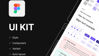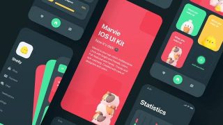
Last updated: August 11, 2026
Quick Answer: A well-matched UI kit can shave roughly 20% to 40% off repetitive interface work on standard screens. But there is a catch. You still have to adapt it carefully and verify accessibility with your team or a professional. In this article on how to use a UI kit to speed up your design workflow, the aim is simple: cut redraw work, improve handoff, and keep the system coherent.
- A UI kit is most useful when you reuse common patterns like login, settings, dashboard, and checkout screens.
- Standard component states matter: default, hover, active, disabled, error, loading, and empty.
- Figma, Material Design, Ant Design, Chakra UI, Carbon, Radix UI, and shadcn/ui are common reference points for matching design and development.
- Good handoff depends on shared tokens, naming, spacing, and state definitions.
- Accessibility checks should happen early, especially for contrast, keyboard focus, and error states.
- For authoritative guidance, see Material Design, the W3C WCAG 2.2 recommendations, and Figma’s component documentation.
A UI kit speeds up design once you stop treating it like a pretty shortcut and start using it as a system: shared components, styles, and rules that let you build screens faster without redrawing the same button, form, and table ten times. Product people usually ask the wrong question first. Should I use a UI kit? Better question: how do I use one without making the work generic, brittle, or harder to hand off? For how to use a UI kit to speed up your design workflow, the answer is usually to match the kit to the product, the team, and the codebase.
What a UI Kit Actually Helps You Finish Faster
If you spend most of your day rebuilding familiar interface parts, a UI kit trims a lot of repetitive effort. Login flows, settings pages, dashboards, checkout steps, content editors — those are the easy wins. You get a starting point that already has structure. But when the job is exploratory brand work, unusual data visualization, or a highly bespoke product, the kit can slow you down. Then you are fighting defaults.
Four gains show up again and again: fewer blank-page starts, fewer decisions about basic controls, fewer layout inconsistencies, and less back-and-forth with developers. I’d reach for a kit when I need to move from concept to a believable interface quickly. Not as a substitute for product thinking. A kit can give you a button. It cannot tell you whether that button belongs on the screen. Nielsen Norman Group has long noted that reusable patterns reduce design and development effort when they fit the task.
Here is the trade-off against the obvious alternative. Starting from scratch gives you more freedom and more original visual direction. A UI kit gives you speed, predictability, and easier collaboration. The cost? You inherit someone else’s structure, naming, spacing, and sometimes their assumptions about interaction. Material Design and similar systems are built around that reuse, which is why they work well for many products. A shortcut. And a constraint.
| Situation | Best Path | Why Other Options Fail |
|---|---|---|
| You are designing a SaaS app with standard flows | Start with a UI kit and customize the parts that matter | Starting from scratch wastes time on common controls |
| You are creating a brand-first marketing site | Use only selected kit pieces, not the full system | A full kit can flatten the visual identity |
| You are building an unusual tool or complex data product | Treat the kit as a base layer, not the final design | Default components may not fit the workflow |
| You need fast developer handoff | Use a kit that matches the dev stack closely | A beautiful but mismatched kit creates rebuild work |
If you are choosing between a kit and blank canvas, ask yourself: am I inventing the interface, or assembling known patterns into a useful product? That answer changes everything. Unsure? Ask your product team or another design professional before standardizing the system.
Quick check: if most of your screens reuse familiar controls, a UI kit will probably save time; if most screens need new interaction patterns, it will only help in pieces.
If You Need Speed Now, Start With the Right Kind of UI Kit

Under a deadline, don’t grab the first polished kit you see. Pick the one that fits the way you already work. For Figma-first teams, that means checking component structure, variants, naming, and whether the kit is easy to extend. For design-to-development workflows, it means checking whether the kit maps to a system your developers already use, such as Material Design, Ant Design, Chakra UI, or Carbon.
Fast mockups? A broad kit with many prebuilt components helps. Long-lived product? A kit with strong token structure and consistent states matters more than sheer volume. A giant component library is not automatically useful; it can turn into a junk drawer. Figma’s own component documentation emphasizes reusable components and variants, which is one reason structured kits are easier to maintain.
My rule of thumb is blunt: if the kit has clear states, spacing logic, and accessible basics, it beats one that merely looks complete. A pretty kit with missing hover, focus, error, and disabled states creates extra work later. That’s where the wheels come off. The W3C WCAG 2.2 guidance is a good reference for those checks.
Use this path if you are trying to get from idea to reviewed screens quickly:
- List the screens you need first: onboarding, dashboard, settings, billing, editor, or whatever the real scope is.
- Check whether the kit already includes those patterns, not just generic buttons and cards.
- Inspect component variants: default, hover, active, disabled, error, loading, and empty states.
- Confirm the spacing and typography tokens are easy to edit globally.
- Build one full screen before you commit to the kit for the entire project.
- Only then expand into the rest of the flow, reusing the same structure.
For Figma, I’d also inspect auto layout, component nesting, and update behavior. A kit that falls apart when you change one parent component is not a time-saver; it is hidden debt.
Quick check: if you need a usable first draft by the end of the day, choose the kit that already covers your core screen patterns and is easy to edit globally.
How to Adapt a UI Kit Without Making Everything Look Generic
Use every component exactly as shipped, and your product starts to look like the kit. Change everything, and the time savings vanish. So the sweet spot is selective customization: keep the structure, tune the parts users notice first.
I’d begin with the elements that carry brand and trust: color, type, spacing rhythm, corner radius, icon style, and illustration style. After that, leave low-visibility utility patterns alone unless the product needs something special. Buttons, form fields, tables, tabs, drawers, and modal behavior can often stay close to the original kit. The unique work belongs in the content hierarchy, the information architecture, and the moments that matter to your users.
Need speed without chaos? Use this sequence:
- Set the design tokens first: colors, type scale, spacing, shadows, and radius.
- Replace only the components that are most visible on first load, such as hero sections or primary navigation.
- Keep utility components close to the kit unless they conflict with your brand or workflow.
- Update icons and illustration style so the product feels consistent.
- Audit contrast and focus states before you move on; speed means nothing if the interface is hard to use.
- Make a small “do not change” list so later edits do not break the system you just set up.
Honest downside: this approach still needs judgment. A UI kit will not save you from bad hierarchy or weak product decisions. It mainly stops you from spending energy on repetitive UI plumbing. If you are working on how to use a UI kit to speed up your design workflow, this is the part where judgment matters most.
If you are working with a stakeholder who wants “something custom,” skip the abstract debate about originality. Show them one kit-based screen with your brand tokens applied, then one without. Most people care more about clarity and fit than about whether every corner was drawn from scratch.
Quick check: if the kit feels generic, change the brand-defining layers first and leave the utility patterns mostly intact.
How a UI Kit Changes the Design-to-Development Handoff
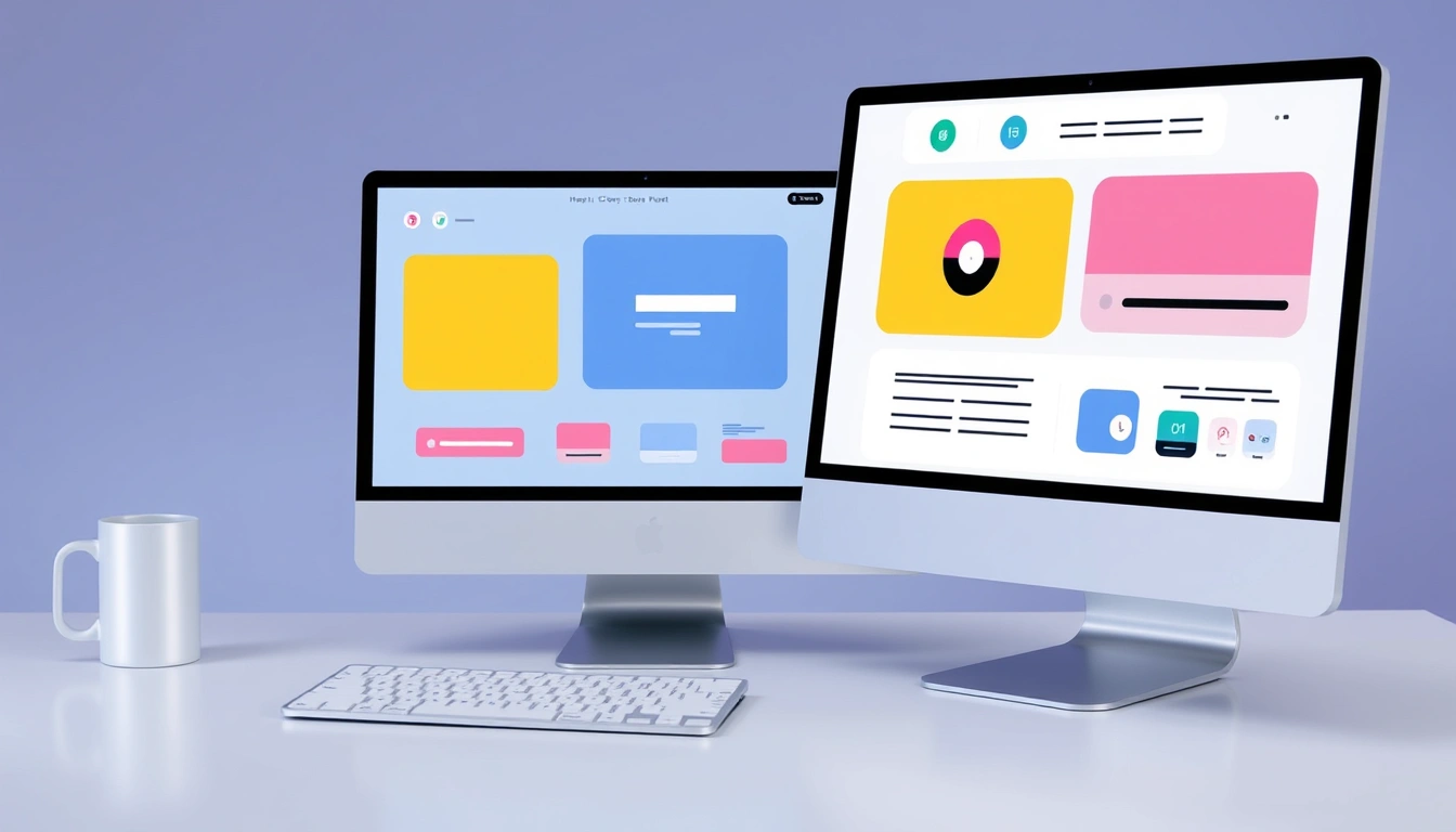
Small mistakes keep coming back from development? A UI kit can help a lot — but only if it lines up with the codebase. The fastest workflow is usually not “design faster.” It is “design in a way developers can reuse.”
If your developers already use a component library like Material UI, Ant Design, Chakra UI, Radix UI, Carbon, or shadcn/ui, I’d prefer a kit that mirrors those patterns closely. That cuts translation work. If the design file shows one kind of modal and the codebase ships another, you are creating an argument before the build starts.
The big handoff win is consistency. A UI kit gives you a shared language for states, sizes, and variants. That means you can specify less, because the system does part of the explanation for you. But there’s a trade-off: the kit can lock you into assumptions the code team may not want. Fine, if you know it early. Painful, if you discover it at the end. The Google Material Design guidelines are a useful external reference for component consistency.
Use this path when handoff speed matters:
- Identify the component library or front-end framework the developers actually use.
- Compare the kit’s components against that library’s real patterns and names.
- Map the important variants: primary, secondary, destructive, disabled, error, and loading.
- Document only the differences that matter, such as custom spacing, labels, or behavior.
- Share the kit’s component rules with developers before screen-level polishing.
- Review one implementation together before scaling the pattern across the product.
This is where a lot of generic advice breaks. People say “use a UI kit to save time” and ignore the cost of mismatch. A beautiful kit that does not resemble the code components can add days, not save them.
Solo designer handing work to a small team? I’d bias toward simpler systems with fewer custom variants. Mature product team? Consistency with the existing component library matters more than visual novelty.
Quick check: if developers already have a preferred component system, pick a kit that speaks the same language instead of forcing a translation layer.
When the Standard UI Kit Advice Is Wrong
For unusual products, the usual “just start from a kit” advice can be a trap. A UI kit is not the right answer when the product’s value lives in novelty, specificity, or deep interaction design.
Complex analytics tool with custom charts, dense filters, or unusual table behavior? A generic kit may help only at the shell level. The real work is in the data presentation and interaction model. In that case, I’d use the kit for navigation, forms, dialogs, and layout scaffolding, but design the core workflow almost as a custom system.
Brand refresh for a high-visibility product? A kit can also be too limiting. The more your product depends on a distinct visual voice, the more selective you need to be. Use kit pieces where they save time, and replace the pieces users see first.
If you are working on a startup with no stable product direction, a kit can make iteration easier, but it can also hide weak thinking. Fast screens are not the same as good decisions. I’d use the kit to test options quickly, not to lock in design too early.
The standard advice breaks down in these situations:
-
Situation: highly custom workflows
What changes: the core interaction matters more than component reuse
What do instead: design the workflow first, then apply kit pieces around it -
Situation: strong brand differentiation
What changes: visual identity is part of the product value
What to do instead: customize the visible surfaces and keep utility components standard -
Situation: poor developer alignment
What changes: handoff cost can erase design speed
What do instead: match the kit to the code stack before you build much -
Situation: experimental product direction
What changes: you need flexibility, not polish
What to do instead: use the kit for rough structure and avoid overcommitting to a style -
Situation: accessibility is already a pain point
What changes: default styles may not be enough
What do instead: audit contrast, keyboard states, and focus order early, and do not assume the kit has you covered
Quick check: if your product’s main challenge is not standard UI assembly, use the kit sparingly and keep the hardest parts custom.
The Workflow I’d Use Step by Step
If I had to build fast without losing control, I would use a UI kit in a very specific order. Most people get this wrong: they open the kit and start styling random components before they know what problem they are solving.
Start with scope. Then map the highest-use screens. Then lock the system tokens. Then build one full journey. That order keeps you from polishing the wrong thing.
- Write the exact screens you need for the first pass.
- Pick a UI kit that already covers those screens or the closest patterns to them.
- Set your tokens first so the kit bends toward your product, not the other way around.
- Build one critical user flow end to end, such as signup to dashboard or cart to checkout.
- Check for weak points: empty states, error states, loading states, and edge-case content.
- Review the screen with development in mind and remove any custom choices that add no value.
- Only after that, expand the design system into the remaining screens.
I’d choose this path over “just make the screens” because it keeps the system coherent. A UI kit is fastest when you use it as a framework for decisions, not a pile of ready-made parts.
There is also a practical cost to running a kit in real life: maintenance. Once you customize it, someone has to keep tokens, components, and documentation aligned. Small teams usually feel that first. If you are a solo designer, keep the changes disciplined or the speed advantage disappears.
Quick check: if you want the kit to save time over the whole project, not just on day one, build the system first and the screens second.
Edge Cases Where the Normal Advice Breaks Down
If you are in one of these situations, standard UI-kit advice usually misses the point because the real constraint is not speed.
-
Situation: you inherit an old product with messy screens
What changes: the problem is consistency, not starting point
What do instead: use the kit to normalize the most repeated patterns first, then tackle the worst screens -
Situation: the product must support complex tables and filters
What changes: data density matters more than visual polish
What do instead: choose a kit with strong table and form patterns, or build those parts separately -
Situation: you need strict accessibility compliance
What changes: default component styles are not enough
What do instead: audit keyboard behavior, focus visibility, contrast, and error messaging before approving the kit -
Situation: your team changes direction often
What changes: over-customization becomes expensive quickly
What do instead: keep the kit closer to default until the product direction stabilizes -
Situation: the kit is beautiful but poorly documented
What changes: maintenance time rises sharply
What do instead: test how fast you can change one component before committing to it -
Situation: the kit looks complete but lacks state coverage
What changes: missing states create hidden design work
What do instead: verify hover, active, loading, error, and empty states before adoption
Quick check: if the product is already hard to manage, choose the kit that reduces variability, not the one that only looks polished.
What to Remember Before You Commit
If you want to use a UI kit well, treat it as a decision system, not decoration. The kit should help you move faster on repeated patterns, reduce translation work, and keep the design consistent from screen to screen. It should not replace product judgment.
That means you should choose the kit based on the screens you actually need, the states you actually use, and the code stack your team actually ships. It also means you should customize selectively and protect the parts users notice first. A UI kit is most valuable when it saves time on the next ten screens, not just the first one.
If you remember one thing, remember this: how to use a UI kit to speed up your design workflow is mostly about matching, not magic. Choose the right system, check the states, keep the handoff aligned, and verify accessibility early.